90% of the snap judgements about purchases are made, based on the color of the products
85% consumers name color as the primary reason behind their purchases of a particular product
80% consumers think that brand recognition can be improved by choosing the right colors
A lot of things around us change our emotions and state of mind. Colors have a lot to do with this. However, the impact that colors have on humane emotions may differ from person to person depending on various factors such as age, gender, personal experiences, personal preferences, upbringing, cultural contexts, and neurological variances.
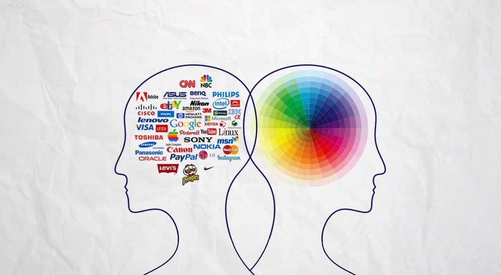
Many marketers and branding experts have started recognizing the power that colors can have on the purchasing decisions of their consumers, which is why a lot of research is being done on brand color psychology.
The first thing that consumers remember about a brand is its color. Color can change the way consumers look at a brand. It’s not just this. By using the right colors a brand can also successfully stand out and enjoy a competitive edge in the market.
Color is something that determines the personality of your brand. Therefore, it is very important to choose the colors in relation to the products that you are trying to sell.
For instance, no one would buy a Harley Davidson Motorcycle if it was in pink or a glittery color. It would spoil the rugged and cool look expected by its customers.
Understanding the psychology of colors in branding is very important if you want to change the way people feel about your brand.
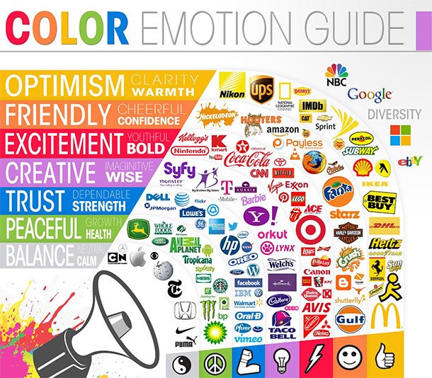
Different colors have different meanings when it comes to branding. Warm hues such as red and yellow are energetic, uplifting and bold, while cool shades such as green and blue are calmer and feel more reserved.
There are three things you need to consider while choosing the right colors for your brand:
- It has to align with the identity or promise of your brand
- It has to make you stand apart from your competition in the industry
- You should be able to integrate the color seamlessly across your brand
Choosing brand colors for a new brand can be a decision that is painstakingly laborious. A little bit about how effectively some of the international brands use colors can clear a lot of your confusions.
Different Brand Color Psychology
Blue
Blue is considered as one of the coolest colors to use when it comes to establishing brand identity since it denotes trust, commitment, dependency and inspiration.
It is also the color of nature since you can see it in the skies and the deep blue sea. Known for its calming and tranquil effects, blue is also referred to as the color of harmony.
![]()
33% brands use blue as the color in their logos.
Facebook, AT&T and Twitter use blue because it represents interpersonal communications, trust, and honesty.
Samsung, Intel, and IBM use blue because of the calming effect it creates on their customers.
Financial brands such as American Express, Intuit, and Wachovia make use of blue because of its conservative and trustworthy properties.
Many businesses in the insurance industry such as MetLife and Allstate also use blue as it denotes responsibility and reliability.
You will also need to consider the different meanings that the different shades of blue convey, before using it as your brand color…
- Use pale blue if you want to convey freedom, inspiration, and creativity.
- Sky blue denotes calmness, selflessness, and helpfulness.
- Azure blue can be used by brands that are ambitious, purposeful, and determined.
- Dark blue stands for knowledgeable, serious, and responsible.
- Turquoise blue represents harmony, clarity, and self-expression.
- Teal can be great for trustful, spiritual, and sophisticated brands
You can also use blue in combination with any other color such as white, yellow, green, or orange to represent the unique identity of your brand. Orange is one of the most colors used along with blue as it stands right opposite to blue on the color wheel.
Takeaway: Blue is a universal color that has been used by many brands across industries. Choose your shade wisely depending on the brand message that you want to convey. If it is a very popular color in your market segment, it is best to avoid the color altogether in order to stand apart from your competitors.
Red
Red is a color that denotes fire, danger, and blood. It evokes feelings of heat, warmth, excitement, love, passion, and sexuality.
It increases blood pressure and heart rate and excites and motivates its viewers to take action.
Oracle, YouTube, Puma, Canon, and many of the big brands prefer red in their logos.
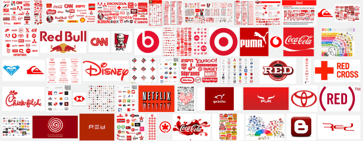
Apart from energizing our bodies, red is also known to wet our appetites, which makes it a best color for businesses in the food industry. Coca-Cola, Red Lobster, KFC, Red Bull, Jack-in-the-box, all use red in their logos.
Brands such as Virgin, Essie, and Ferrari that are into selling sexy products, use red because of its association with passion, lust, sensuality, and love.
Diesel, Canon, and Nintendo that sell masculine products use red in their logos mainly for its bold masculine power.
However, many brands stay away from using red in their colors because of its negative meanings such as anger, aggressiveness, over-bearing, tiring, domineering, ruthless, fearful, intolerance, quick-tempered, obstinate, rebellious, violent, brutal, and resentful.
Here are a few things you need to know about the different shades of red before using it as one of the main colors of your brand:
- Darker shades of red represent professionalism, luxury, and command while brighter shades are associated with energy, excitement, and economy
- You can use Burgundy as a brand color if you want to seem sophisticated, subtle, or serious.
- Crimson would be the perfect color to denote power, sensuality, and determination
- Scarlett would be good for fun and enthusiastic brands that represent love
- Maroon is generally associated with strength, courage, and control./li>
While many colors can be used in combination with red, green is one color that most brands avoid because of the strong association of the color combination with Christmas holiday.Takeaway: Since red is one color that has many powerful meanings, it needs to be used with discretion. However, if other brands in your market segment are trying to avoid red, it would be a great way for you to gain some recognition in the market.
Orange
Orange, a blend of red and yellow, is all creative, adventurous, youthful, and fresh. It is associated with fun and vibrancy.
The fruit orange is probably the first thing that comes to your mind when you think of the color orange.
Apart from freshness, it also denotes affordability. Since it is a color that stimulates conversation, it can be beneficial for many brands that are trying to reach out to millennials through social media.
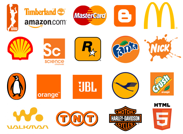
Amazon, Home Depot, and Hooters use orange in their branding to highlight affordability and quality service. Orange also makes them seem warm-hearted and sociable.
A color that facilitates the risk-taker and extrovert in all of us, it is one color that works extremely well for sporty outdoor brands such as Harley-Davidson, Timberland, and Cincinnati Bengals.
The qualities of vibrancy and flamboyance associated with orange makes it a natural choice for brands like Fanta, Nickelodeon, and Mozilla Firefox that want to express their optimism and self-confidence.
Although there are many brands that are fans of the color orange, there are quite a few that avoid the color due to its over-bearing, self-indulgent, superficial, insincere, dependent, pessimistic, cheap, overly proud, unsociable, and exhibitionistic properties.
Here are a few things you need to know about the variations of Orange you can use in branding:
- The color peach, which is a combination of yellow-orange, can work well for easy-going brands that are conversational and full of etiquettes.
- Golden orange denotes encouragement, self-control and vitality.
- Amber is a shade of orange that is associated with self-esteem, arrogance, and confidence.
- Burnt Orange represents self-assertion, tension, and pride.
- Darker shades of orange can be used by brands that are opportunistic, overly ambitious, and self-serving.
As a combination, blue is a good color that can be used with orange because of its subtleness.
Takeaway: Orange is best suited for enthusiastic and youthful brands that wish to attract the millennials. If you are a luxury, or a traditional / serious brand, it would be best for you to avoid orange in your branding.
Yellow
Yellow, the color of sunshine is something that puts a smile on your face. It is related to cheerfulness, optimism, playfulness, joy, energy, and friendliness.
Apart from its warm and playful attributes, yellow is also known to be a stressful and a depressive color, depending on the shade and tone that is used. Because of these qualities Yellow is also known as a bipolar color.
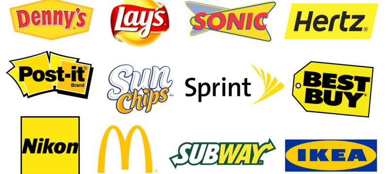
Fast is one word that comes to your mind when you think of Yellow and this is why many fast food restaurants choose to use yellow in their branding.
While stimulating the appetite of their customers the color also makes them move on quickly. Brands like Sprint, McDonald’s and Ferrari that represent speed and movement are known for their yellow branding.
The fun and playful qualities of yellow makes it a great fit for brands that are into lifestyle and entertainment. Retail establishments such as IKEA, Spike, and Best Buy use yellow because of its eye-catching nature that can capture the attention of people despite other distractions.
Yellow is known to stimulate the logical side of our brain. It improves mental clarity and educational competence, and helps in the decision-making process. Many informational companies that sell academic-related products such as Yellow Pages, Bic, and Post-it are fans of yellow since they communicate logic.
Despite the huge fan following for yellow branding, there are many brands that avoid using yellow in their brand colors because of its overly analytical, pessimistic, egotistical, impulsive, impatient, judgmental, critical, cowardly, deceitful, spiteful, non-emotional and uncompassionate qualities.
Here is what the different variations of yellow denote:
- Light and clear shades of yellow represent mindfulness, alertness, and clarity
- Lemon yellow may be used to denote hyper-sensitivity, self-reliance, and normalcy
- Citrine yellow is generally associated with instability, deceit, and superficiality
- While Golden yellow represents sensitivity and curiosity, it is also associated with loneliness.
- Cream seems insecure and needy, yet encouraging
- Dark yellow is cynical and depressing and represents melancholy
- Bright yellow is often seen as fast, fun, and flashy
Many brands use colors like white, red, and blue, along with yellow to make their brands appear unique. However, there are brands that use the yellow-violet combination especially when they are running campaigns during the spring and Easter celebrations.
Takeaway: Certain shades of yellow might make your brand look cheap. Choose the right design or combination once you make sure it is the right color to use for your product.
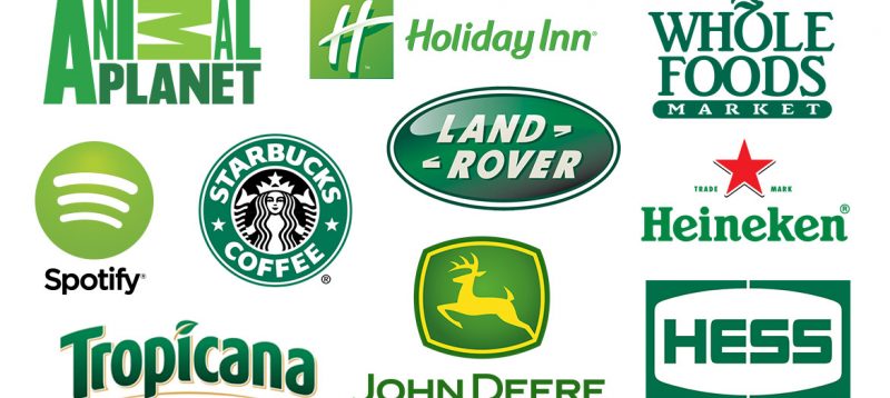
Green
Green can be associated either with nature or wealth. While lighter and brighter shades indicate growth, renewal and vitality, the richer and darker shades represent wealth, abundance, and prestige. Psychologically green is said to balance our emotions and promote clarity of mind. It evokes feelings of kindness and compassion.
The freshness associated with green makes it a wonderful choice for restaurants and food-related brands. Subway, Heineken, and Tic-Tac-Toe- all use green to appear fresh and clean.
Premium financial firms and lifestyle brands such as H&R Block, Land Rover, and Lacoste use Green in their branding to denote growth and vitality. It makes it easy for them to motivate people to join their social groups, creating a need to belong.
Global brands and technology companies such as Acer, Starbucks, and Android use green branding to seem trustworthy and wise.
Animal Planet, John Deere, and Whole Foods are some of the brands associated with nature that use green as one of the main colors in their branding.
While green seems perfect for many brands to use in their branding, it also seems the least-preferred for some because of its envious, selfish, possessive, materialistic, over-cautious, indifferent, greedy, miserly, hypochondriac, inconsiderate, do-gooder, and devious attributes.
Here is what you need to know about the variations of green that you can use in branding:
- Pale green denotes inexperience, youth, and immaturity
- Emerald represents wealth, abundance and uplifting
- Jade can be the choice for brands that want to seem generous, trustworthy, and tactful
- Lime green is associated with naivety, anticipation and playfulness
- Dark green represents richness, greed, and ambition
- Aqua green can be used for its healing, calming, and protective attributes
- Olive green denotes strength, peace and deceit
- Yellow green is for fear, conflict and cowardice
- Grass green is associated with nature, health and self-confidence
Green is generally used in combination with white and yellow in most of the branding activities. Red-green is one of the least used color combinations.
Takeaway: Different shades of green can denote different meanings. Choose your shade wisely depending on what you want your brand to represent.
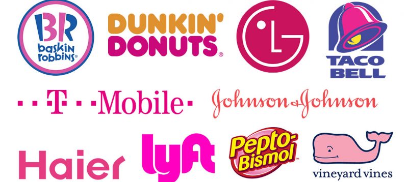
Pink
Pink is one color that has been stereotypically associated with females. It is seen as a romantic, exciting, and sentimental color. Apart from femininity, pink also represents love, innocence, calmness, and optimism.
Victoria’s secret, Barbie, and Mary-Kay that cater to mainly feminine target audience are big followers of pink branding.
Baskin Robbins is another brand that uses pink as one of its main colors in branding to communicate friendliness and bring in a sense of nostalgia.
Baby brands like Johnson & Johnson make use of pink branding due to the innocence and purity that they want to depict.
Pepto Bismol is a medical brand that uses pink in its branding because of its calming and restful effects.
While the calm, non-threatening, innocent, hopeful, optimistic and feminine nature of pink pushes many brands towards using the color in establishing their identity, there are several brands that avoid the color so as to not seem as silly, vulnerable or weak.
Lighter shades of pink seem unconventional, lightly flirty, and non-threatening
Darker shades of pink are nurturing and associated with love and passion
White, Yellow, and blue are the colors that many brands use in combination with pink to establish their unique identities.
Takeaway: Choose your shade of pink based on the mood and feelings you want to convey. Even genderless brands can use pink if they are targeting the gen-Y audience.
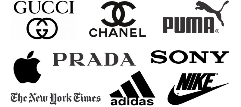
Black
Whether you think of the little black dress or an iconic black turtleneck, it is quite normal for you to associate the color black with sophistication.
However, black is also the color worn by the villains and priests that can imply submission to evil or God. Although a symbol of power, black is a color that absorbs energy and enshrouds the personality. Elegant and authoritative, black still has an ominous tinge to it which makes many brands avoid the color.
Many luxury brands like Louis Vuitton, Gucci, Cartier, Zara, Prada, Chanel, Ralph Lauren, and Lancome – all use black because of its sophisticated look.
Although the fruit apple is originally in red color, the company Apple had used a black apple in its logo for quite some time as a tribute to Alan Turing, the inventor of the modern day computer.
Nike and Adidas use black in their logos to attract the youth
Media and entertainment brands such as the New York Times and Sony also use black in their branding because of its appeal.
Although black is one of the most popular colors used in branding, there are many brands that would like to avoid this color due to various attributes like monotony, melancholy, and evilness associated with it.
While white is the best color that goes in combination with black, you can also use colors like yellow, grey, and brighter shades of red, blue and green. Try and avoid dark shades that tend to blend in with black.
Takeaway: It is always better to contrast black with a brighter color that makes it stand out. If you are looking for a touch of luxe, you can use some gold foil. Also consider the texture and the finish (glossy or matte) before using it in your logo.
White
White is the symbol of innocence and purity. It is known for its sterile and clean attributes which makes it best in healthcare settings. White is also associated with wedding and symbolizes untarnished beginnings. It denotes simplicity, clarity, and sophistication.
As a stand-alone color, white is an impossible color to use in branding. You will always need a colored background that complements white.
Classic black and white logos seem elegant, tasteful, dignified, and fashionable. Nevertheless, you can use any other color such as red, blue, green or any dark shade that complements white well.
When it comes to branding, white is a popular choice of businesses that are into appliances, technology products, medical products, health-related products, and even offices.
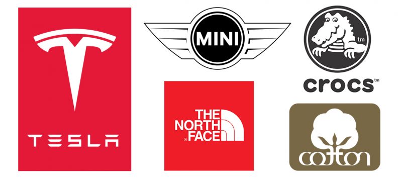
Automobile companies like Mini and Tesla use white because of their heavy focus on simplicity, optimism, safety, and technology
To depict snow, north face gear uses white in its branding as a supplier of high-quality gear that protect people in outdoors.
Crocs is another brand that favors white because of its simplicity and innovative attributes.
A white logo on a brown background, Cotton adds in purity and wholesomeness to comfort and dependability.
Many brands tend to avoid white because of its cold and sterile appeal that makes them seem isolated, empty, unfriendly, and elite.
Takeaway: Use white as the main color of your brand only if it represents purity, transparency, and simplicity.
However, the more the colors you use, the more you may have to spend on printing. Now that you have understood the brand color psychology make sure the colors you choose go together both in print and digital mediums across different sized screens and printers.