Has your favorite color clogged your judgement of choosing products?
You are not alone. 90% of the snap judgements that consumers make about products are based solely on colors.
Colors have a huge part to play when it comes to evoking emotions. That said you can’t just choose any color for your brand. The decision has to be based on your business values and attributes.
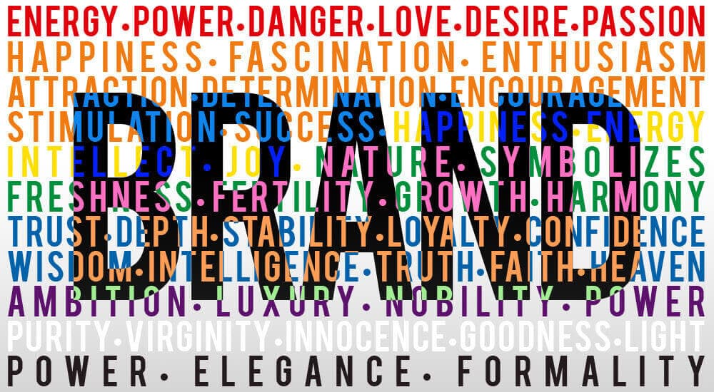
Talking about colors, there are certain common associations that are evoked by colors, which are natural and universal. Color is integral to any corporate identity. So when your logo is red and flaming, yellow and cheerful, black and mystifying – its communicating something to the customer. The human mind is conditioned to respond to color. Colors and their thoughtful combinations stir emotions and tell a story.Red, for instance, is supposedly hot since it is full of fire. It is associated with energy, power, danger, love, desire and passion. Many brands of cars, games and energy drinks that are associated with sports and high physical activity use red.
Orange is associated with sunshine, joy and tropics. It represents creativity, happiness, fascination, enthusiasm, attraction, determination, encouragement, stimulation and success. It is apt for toys and food products.
Yellow, the color of happiness, energy, intellect and joy, is associated with food. It is the color that brands of children’s products use. It also goes well for items of leisure.
Green, the color of nature, symbolizes freshness, fertility, growth and harmony. It is generally associated with money. As it also indicates safety, many brands use green for their medicinal products and drugs.
Blue, the color of the sea and the sky is associated with trust, depth, stability, loyalty, confidence, wisdom, intelligence, truth, faith and heaven. Blue can be used to promote products and services that are related to sky and air (airlines, air conditioners) sea and water (mineral water, sea voyages), and cleanliness (cleaning liquids, water purifiers, vodka). It also works well for high-tech products.
Purple denotes royalty and is associated with ambition, luxury, nobility and power. It symbolizes power and extravagance. Feminine products and children’s products do well in purple.
White, to anyone means purity, virginity, innocence, goodness and light. It is indeed the color of perfection. It is apt for high-tech products, charitable organizations, hospitals, medical products, dairy products and low-fat foods.
Black denotes power, elegance and formality. It can make other colors stand out when used for designing a gallery of photography or art.
Colors are inextricably linked with brands because they instantly convey their messages, without the need of words.
Color is one thing people recall instantly about a brand, when compared to symbols, shapes and words. The two different color schemes of FedEx are excellent examples of “universal” symbolism of colors. While green represents ground services, orange stands for speed and the high energy of air transportation.
If you have looked at the colors of laundry detergents closely, you would have observed that most of them are in blue and orange. That blue and orange package shouts “industrial strength cleaning power,” with blue representing cleanliness and orange, the dynamic energy.
Apple was one of those first few brands that brought color into the marketplace that hadn’t seen color before. With its colorful iMacs, Apple reinvigorated the brand that had gone under huge losses for two years.
Brand color is not the same as logo color. One of world’s most recognized brand colors is the Tiffany blue; yet its logo is only a refined serif type expression of its name in black. The brand has not used its famous robin’s egg blue to paint the exterior of its store. The ritual that is associated with its uniquely colored box has been well-understood by Tiffany. The brand element could be any; but the rule is always one – Less is More!
It may not be psychology revealing exercise to choose a brand color; but it sure is an emotionally charged one. Inspired or pragmatic, color happens to play a critical role in a holistic and integrated brand program. Not only is it visceral it is also meaningful. Color may not do much when it comes to replacing customer experience. Nevertheless, it can paint the same in the best light ever.
Testing is one thing you need to do while choosing colors for your branding and marketing material, be it business cards, signage or your website. Here are a few Dos and Don’ts to keep in mind:
- Don’t use bright and vibrant colors too frequently or over a large area. It can make people squint and even cause headaches. As far as possible combine them with neutrals or use them sparingly.
- Always use high-contrast colors for your store signage or while making presentations for large groups. They improve visibility when seen from a distance.
- Make sure you check out a few common color schemes before choosing the right combination for your brand. You can browse through a few websites for the kinds of colors used and the impact that they create
- Never use complementary colors at one go. Complementary colors are those that are across each other on the color wheel. For instance, yellow and purple or red and green.
Remember – Different colors appeal to different kinds of shoppers. While colors like royal blue, red and orange can attract impulse buyers, there are others such as navy and teal that attract shoppers who are on a budget.
The colors that you choose should be based on the kind of emotions, personality and appropriateness that you want your brand to portray. That said you will also have to assess your competition to find out which colors set your brand apart.
The image, mood and feeling created by your brand can persuade your consumers to a great extent. You will have to make sure the colors that you choose match your brand’s desired personality perfectly.
Many marketing specialists and Researchers have been spending a lot of time on matching brand colors with messages that the consumers receive. Nevertheless, color is something that totally depends on subjective experiences. But still it is possible to attract customers through the known psychological effects of colors.
So, have you made your decision on the color of the packaging for your product? What about your logo color? Do you think it matches your brand’s personality? What colors do you wish to use on the website of your brand new business? Make sure you do your homework before following your instincts.