A brand’s logo is its representation to its consumers. It is also a big part of what attracts a potential customer to your brand. A logo must therefore be designed with care. Minimalist, elegant, or flashy, your logo must be able to catch the eye of the potential consumer and be unique and easily recognizable to those familiar with your brand. Since colours affect emotions deeply, which in turn drive behaviour, your logo colour scheme plays a significant role in your marketing campaign. Sadly, the colour scheme is also the single most ignored aspect of the logo design in India – especially when it comes to small businesses.
So here are some common logo colour schemes that can be your guide to designing the most eye-catching logo for your business.
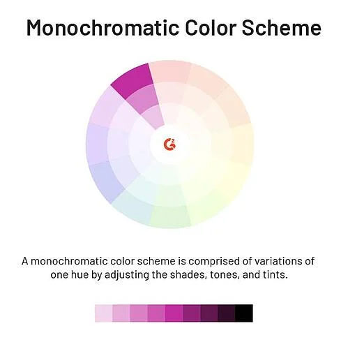
Monochromatic colour scheme
This one is the simplest to use – go with a single colour and use different hues, shades and tones of the chosen colour. Most logo designers prefer to keep it simple using just two shades of the same colour making a clear statement of authority.

Source: Coca-Cola Logo Evolution — Famous Logo History – Medium
Simplistic yet awe-inspiring, the likes of Starbucks, Coca-Cola, and Nike have achieved great success with the monochromatic logo colour scheme using shades of grey and red respectively.
The idea is to create a simple yet decisive statement for your brand. Don’t forget that it should align with the message you want to send out with your brand image – like Coca-Cola says – Refresh the world. Make a difference underling this with a single colour logo contrasting with the black of the drink itself. Together, they create an image of a misty, dewed bottle of a cool drink that will quench your thirst.
Recommended: Logo Design Mistakes to Avoid for Your Brand
Analogous colour scheme
Talking of analogous colours, Mc Donald’s comes to mind. A simple yet attractive contrast of red and yellow with the first alphabet of their brand is what differentiates the MacD logo. Not only is it appeasing to the eye, but it also makes a clear statement of class, dependability, and trust. Other brands that use the same two colours are Burger King – a MacD competitor – and Lays to name just two while Cadbury uses the analogue of violet and white to make a sharper impact. The trick is to use two colours that are close together on the colour wheel yet contrasting.

Image Source: Wikipedia
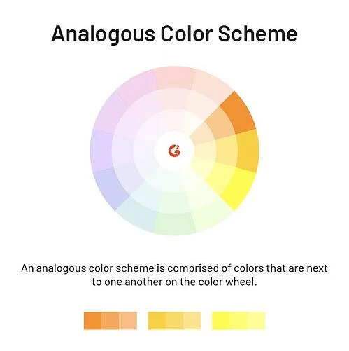
The Analog colour scheme can be used to evoke a multitude of emotions from the subdued affordable-meal statement of McDonald to the vibrant and joyful purple and white of Cadbury.
Complementary colour schemes
This scheme uses two colours on the opposite sides of the colour wheel to generate a sharp, contrasting, image that is attractive to the viewer and pleasing to the eye. While many may term them flashy, think of the familiar with FedEx, Master Card, and Tide images – though Tide uses more than two colours. While the Tide logo is bright, eye-catching, and appealing signifying freshness, the FedEx and MasterCard contrasts are muted yet making a clear statement of dependability. The contrasts in complementary colour schemes are designed to grab the attention of the viewer and entice them to probe further.
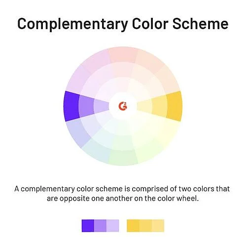
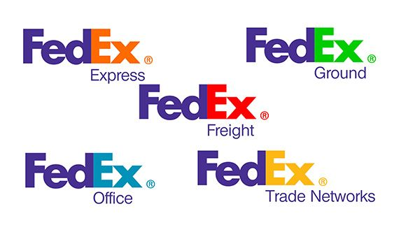
Image Source: logodix.com
Complementary colours work well for brands that have a sharply focused message and a bold mission statement.
Recommended: A logo design must better be as good as the brand itself
Tetradic colour schemes
This is a richer and fuller colour scheme using two pairs of complementary colours and forming a rectangle on the colour wheel – which is why the scheme is called the colour rectangle. The vibrant and sharp contrasts of the Tetradic – or the double complementary – scheme are appealing to the eye because of the colourful look they give to your logo. This scheme is versatile in that it can be used to evoke a range of emotions and also allows you to select one – or two – dominant colours to align with your mission and vision statement as well as your marketing message.
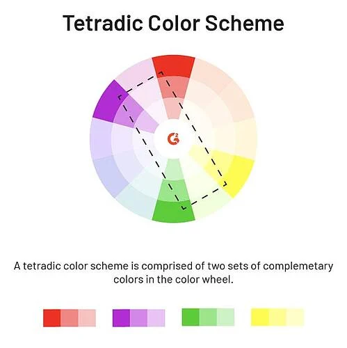
FedEx, for instance, uses the orange and green contrast on white as their primary logo and leverages the rectangle to differentiate its services. The Tetradic serves to make a firm and decisive statement.
Triadic colour schemes
Often confused with tetradic, this colour scheme uses three colours to make its statement. Talking of the triadic colour scheme brings the vibrant and fiery Firefox logo that depicts yellow fire over shades of red and blue – in complete alignment with its brand name.

Image Source: betanews
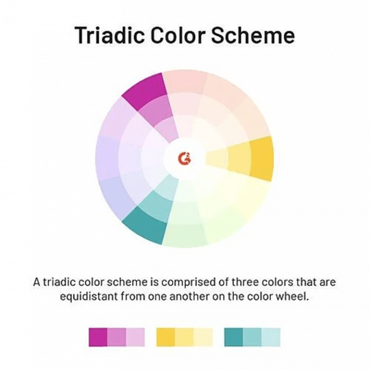
Triadic logo colour combinations use three colours equidistant from one another – forming a triangle – on the colour wheel. The red blue and mustard of the Firefox logo is a classic example evoking a feeling of contrast, competition, daring, and dash yet presenting a harmonious and appealing look. It is completely in alignment with its brand name signifying the fire of competition and leadership. Other brands that use the triadic colour scheme include Microsoft, eBay, and Fanta, each evoking a different emotion.
Split complementary colour scheme
Two pairs of complementary colours adjoining one another on the colour wheel are used in the split complementary scheme. The red green, white, and black colours of Fanta are a good example of this colour scheme to signify freshness and energy. Orange is a combination of red and yellow making the red even more significant while green contributes an element of purity. Other brands that use the split complementary scheme are Master Card with their red and orange discs, Hershey’s with grey and brown, and Deep Brewing Co. which goes with muted shades of beige and brown.
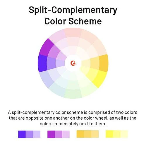

Image Source: 99designs.com
Colour Scheme Image Source: Learning Hub
While these are the most commonly used logo colour combinations there can be may “grey” areas between them. After all colour and design are art forms that cannot be compartmentalized or categorized. The idea is to go with logo colour schemes that depict your brand’s mission, message, goal, and above all emotion.
Litmus Branding provides logo design in India along with a host of other branding services.
