Have you ever tried to understand trends?
Mysterious – aren’t they?
You never know which trends manage to stay for years and which ones fail to stick on. There are only a few that manage to shift and evolve over time.
So, do you know what the driving force behind these trends is?
It is Design. And not just the driving force, design is also the result of these cycles of trends.
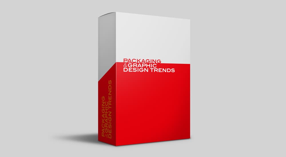
Apart from the product design, there is also the packaging and the graphic design. While packaging design attracts the attention of the customers, graphic design conveys the right marketing message in a simple yet attractive way.
Packaging design speaks a lot about the quality of the product. It can create a lasting impression in the minds of the customers and even increase their brand loyalty. Graphic design, on the other hand, is more about establishing the brand image and creating awareness about its values.
There are trends when it comes to packaging and graphic designs. And these trends keep changing with time. You need to be aware of the colors, symbols, shapes or lines that are in circulation before coming up with the right design for your brand.
Every creative designer would like to have his/her own style when it comes to packaging or graphic design. While this is necessary, there is also the need to take a look at the trends in order to understand what is being used in the industry. They can give you an idea about the design elements you need to follow, while coming up with your own personal design.
Go Transparent with your packaging
What the customers see is what they should be able to get, when they buy a product from you. This is why your packaging should display the truth.
When people buy food products, they want to see what they wish to purchase. This is why many food items come in transparent packaging. The easily readable ingredients make it convenient for the customers to understand where the food comes from and what process it goes through during production.
The need for ethical products is seen in technology too. There is this ethical smartphone company called Fairphone which tracks every step of manufacturing.
When you buy a Fairphone, you will know exactly what it has gone through before coming into your hand. The sourcing of conflict-free minerals, the process of manufacturing, the work environment at the factory – it is all too evident. The transparent packaging adds to the ethicality by showing you what your phone is made up of.
Embrace Illustrations
Creating hand-drawn graphics and icons is another trend many businesses have started following. This tends to bring in the organic effect that will create an instant human connection.
Fluid imperfections such as natural texture fills and irregular lines add in a touch of warmth, making the products stand out amidst the general digital designs. The handmade feel tends to communicate a feeling of nostalgia by creating an emotional tie.
Narrate your brand story through your packaging
There are a few businesses that have started incorporating narrative illustrations in their designs. Not only do they give you the complete story behind the design, they also manage to transport you to a world of fantasy.
Take for instance, the packaging designs created by Owen Davy for Elderbrook labels and Smashmallow. Apart from displaying the full brand identity, these designs also create the perfect mood that drives customers towards purchasing the products.
Try going vintage
Vintage designs can never go out of trend no matter how much advancement happen in technology. They tend to resonate through time. While they bring in the nostalgic feel to people who have lived through the original era, they also manage to satisfy the curiosity of the younger generations, who are eager enough to explore the past.
One thing you need to keep in mind while going vintage is to strike the right balance. For instance, if you have seen the packaging designs of Makers & Merchants, you would agree how important it is to maintain a sharp and a modern look, while focusing on evoking nostalgia.
Focus on your Logo
You must have come across many vector-shaped logos. These are quite popular among the digital start-ups and the traditional brands that relate to younger consumers. All of these logos are made up of simple lines and bold color patterns. Kodak, co-op and Natwest are some of the brands that have tried this.
Making your logo responsive is very important in today’s world, where more and more smart devices are coming up in different sizes and forms. Try heading to the websites of Coca-Cola, Nike and Walt Disney and then resize your browser window to see how their logos change responsively as per the size of your browser. The Coke logo for sure is responsive without actually impacting the brand-recognizability.
Whichever type of logo you choose, you have to make sure the design is simple and easily recognizable. This is exactly why Twitter refined its logo to a simplified version of its bird. No more do you see the bubble type that used to make the bird appear as if it was talking or smoking a hookah. The unnecessary details such as the lower case ‘t’ and the twitter word-mark have been done away with. It is now just the bird.
Incorporate Cinemagraphs in your graphics
Cinemagraphs refer to still photographs with a single, minor movement. The image is usually in GIF format and works fast to grab the attention of the viewers. It effectively solves the biggest problem of modern marketing – the lack of time. The rising competition in every field is sure to bring in many cinemagraphs to your screens.
Go modular in your layout
If you want more and more people to interact with your brand, you will have to make your information more manageable. This is only possible by adopting a modular layout. It can make your website look absolutely professional by breaking up your text into manageable chunks.
Apart from the above, here are a few more trends that can help you captivate your viewers…
You can mix up bold and sleek text with the right images and come up with a design trend that exudes style and class
You can combine text and photography to create some brilliant borders and great contrasts
You can use contrasting colors in duotones to make your images pop up on the neutral backgrounds of your blogs or social media sites
Whatever trend you follow, you have to make sure your design is simple, authentic and meaningful. Remember – trends come and go; but they are impactful only when they can communicate the brand values and create that human connection.