Let's Talk
We would love to hear from you. Want to know more about our services or have any questions? Say Hi!


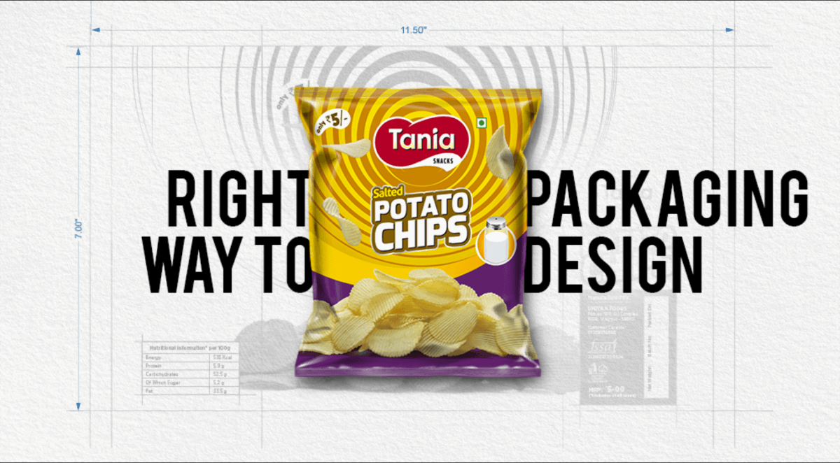
The Right Way to Design Packaging For Your Product
Not all good things come in great packages or vice versa.
Sometimes, the response to careless planning can be disastrous for the brand. Wolfgang Puck, the Austrian-born American celebrity chef and restaurateur discovered it the hard way when his self-heating latte cans started exploding on the retailer shelves. You bet it wasn’t the Mentos-Coke kind of fun experiment. It was pure disaster for the brand and the issue soon became too hot for the celebrity chef to handle.
Colgate’s all-purpose cleaner ‘Fabuloso’ faced a similar issue, when a design wizard attempted to make it look like a soda or a beverage bottle.
The outcome?
Child consumers started getting confused with its fabulous colours and started gulping it. A few tragic poisonings episodes and dozens of phone calls from frantic parents later, the product got recalled from the shelf and the manufacturer was forced to apologise to its customers, admitting it made a terrible mistake with the design.
While these may be one-off, extreme cases, packaging business requires both time and resource in puts — oodles of it – to be hugely successful.
While manufacturers understand the value of investing in the core engineering of the product, very few, if at all, appreciate the trouble they need to take in the final packaging as well, which must necessarily also go through tedious, testing phases for quality assurance.
It might be okay to break a few design rules, in order to come across as wacky, if you waver too far from the norm, the design may come back to boomerang on you, as these two case studies we discussed above show.
From labeling to layout, colours to pack size, everything must be pat and flawless to meet the Litmus test of good and efficient marketing in a marketplace that is choking with innovative products of all kinds.
First Get the Print Right
Let’s say the design is done in 8K colours, while the printer has a 5K limitation. Your graphic designer needs to understand these limitations in order to give better outcome.
Besides, the resolution a needs to be right and compatible with the intended template. The colors you read on the screen should match with those created by the printer, while the designers also need to know the intrinsic quality of the paper being used – will it absorb ink, rip easily, hold the design properly, blah, blah, blah.
No harm in getting a prototype done before taking a more informed decision, because once the print button is struck, there may not be any reversal possible, writes Grace Fussell inHow to Get Started With Product Packaging Design.
Next Get Your Material Right
Very often, companies end up using more material than is actually required. Too much is a complete waste, not just of cost, time and resources, but also your effort in wrapping it all in one pack!
Not to mention the colossal damage caused to our precious environment. Be prudent. Remember less is always more when it comes to the use of packaging material. Use, only what you necessarily have to.
Style It Right
Necessarily ask yourself – who are my customers? Where are they buying your product? From the local supermarket? “Then bigger is indeed better,” says the wag at Packhelp.
On the contrary, if your target buyers are the swinging singles or DINK (Double Income, No Kids) couples, smaller is cooler.
Eventually, whether you are throwing in one or 100 items in your family pack, keep the size in mind before you set out to design.
Place It Right
Don’t ever try too hard to shine. That’s what prostitutes do, and it takes the shine off from what they are trying to do. Instead go a tone easy to make your brand appear elegant and classy – aspirational not desperate.
Consumers will recognise any crude attempt at wooing them and will instantly be turned off. Don’t ruin your brand with a louder-than-necessary packaging.
Is Your Typography Right?
Look closely at the printed text. Is there too much space between the letters? Amend that. The letters must sit smart to appear pleasing to the eye. Double-check your kerning. You can’t get messy there.
In typography, errors often stick out like a sore thumb, so don’t play dumb with your choice of letters.
Too Much or Too Little White Space Is Certainly Not Right!
White space is the breathing space. It makes a design easier to digest.
Experts can easily tell a good designer from the bad, if the latter leads no white space or what is technically called the negative space in his visual design. White space is necessary to show off your product in an elegant manner, without any clutter.
A good example is the Google website. Do you ever have to look around for it on the screen, know why? Because it sits bang in the middle, at your eye level, where it should be.
Too Much Clutter – A Strict No, No
At Litmus, we never get tired of saying, less is more. Minimal is the way to go. It will make your design simple and accessible to the lay consumer.
Accessibility is not the same as affordability but they serve the same purpose. Both qualities make a product effective, the first in terms of utilitarian design and the second in terms of pricing.
Our advice is to keep the embellishments to the bare minimum, unless the product calls for it, loudly, as in the case of a lifestyle product.
Get Right With the Hot/Cool Trends
Trends are hot. Trends are also cool. Make sure you stay ahead of both the hot and the cool trends, but don’t fall for any whimsical, passing fad.
Instead of being seasonal, try being stable. It would eventually make you more recognisable. You need to come up with something that will endure the test of time. This way, you will endure the test of time, says one packaging expert.
Finally, Get the Emotional Pitch Right
Believe it or not, even in packaging, your emotional pitch should not go overboard. It should strike just the right decibel – not too shrill, so it gets lost in the din. And not too weak either, so it can’t be heard, above the din.
Graphic designers must be adept at embedding just the right dose of emotions into their packaging. It should go easy on the eye, yet somehow resonate with the target buyer. “It should either evoke a positive vibe or a poignant memory,” recommends the author of the Packhelp piece.
A good example is the labels on tea packs. Always minimalist, they come in comforting colors – lavender, mint green, or chamomile white and are instantly able to evoke feelings of deep tranquility or/and relaxation, says the Packhelp expert.
Eventually, like all good designs, packaging is also a mix of the right ingredients in the right quantity to cause the right impact on the consumer to make him/her impulse buy. So get it right.