Let's Talk
We would love to hear from you. Want to know more about our services or have any questions? Say Hi!


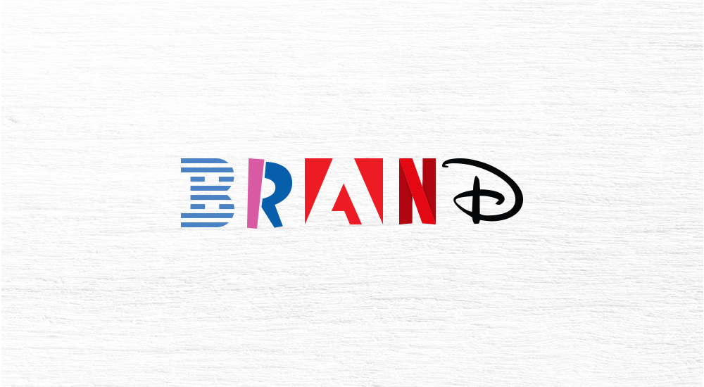
Logo Design Mistakes to Avoid for Your Brand
“Design is thinking made visual,” Says Saul Bass, an American graphic designer and Oscar-winning filmmaker, known as the ‘game changer’ in the field of graphic design.
A 99Designs survey reported that 67% of small and medium scale businesses (SMBs) are ready to invest $500 into a logo design. But the picture gets complex at execution because creating an ’exact’ logo is never an easy task. Especially not in the times of limited attention spans, when so many media formats and brands are jostling for your limited attention. You better be the best of the best!
Physiologically, five to seven impressions on the consumer’s mind are a must-have before they start recognizing a company’s logo, explains Pam Moore, CEO and founder of Marketing Nutz. A logo has to be thoughtful, precise, and with a repeat value.
In A Logo Design Must Better Be as Good as The Brand Itself by Litmus Branding, we shared the relevance of logo design. Today we will take you throw the common logo mistakes that brands CANNOT afford to make. The discussion will include figures and information sourced from 61 Logo Statistics You Can’t Ignore: 2020 Data Analysis & Market Share by Jenny Chang written for Finances Online.
Let’s deep dive –
Colour Wisely
In the headspace, while the audience makes a product judgement at a subconscious level, 60% to 90% of their evaluations are purely colour-based. Do you know that the Google brand logo is multi-coloured, endorsing diversity with a ’not a rule follower’ kind of cheeky attitude.
Garnier Fructis and Starbucks in contrast limit themselves to colour green to represent nature and universal love. Be smart in picking a colour palette that best articulates your brand attributes. Don’t be afraid to go bold. A big brand like Coca Cola has chosen red to stir appetite. The red in YouTube logo inspires an eagerness to watch web videos. Send a coloured message. An astute understanding of colour psychology will assist you in achieving this goal.
“Keep tabs on a design’s holistic look and impact, advises the unidentified author of Inkbot Design in 10 Mistakes Logo Designers Should Avoid. His practical advice – use black and white first, before filling in the colours. Then stay with your colours!
Sufficient Research
A company logo design is its’ single-glance identity’. The thought behind the design must be crystal clear and well-communicated. Some agencies call it the ‘logo rationale.’ While designing a client’s logo, you cannot afford the lack of knowledge. You should know what you want to say!
Katy French in 7 Huge Logo Design Mistakes to Avoid at All Costs penned for Business 2 Community says – “Rookie designers (or impatient brands) will sometimes dive into the brainstorm stage without the proper brand education.” This will definitely lead to a weak brand representation. In fact before starting, for a brand audit survey to pool in all the data inputs from all the stakeholders. Then take a shot at the logo that will speak the language of your client’s brand. Be info-ready!
Recommended: Just Branding
Effortless Engagement
One of the most common logo design mistakes is to construct and then present to the consumer a ’complicated face’. Your logo must demystify the product not make it more complex and confusing.
In 8 Logo Design Mistakes to Avoid at All Costs, Free Logo Services gives a shout out to this idea. Although it’s great to be creative and abstract, you cannot go overboard with the idea and let the message go missing from the brand communication, a key feature of which is the logo. The relationship between a consumer and a brand logo has to be tight, direct and ‘super simple.’ A lot of famous brand logos have taken the wrong road down the line for being too complex and burning their investment in the market that outrightly rejects anything convoluted. These brands then had to reverse their tracks from complex to easy.
This image from Concept Drop illustrates this point clearly.
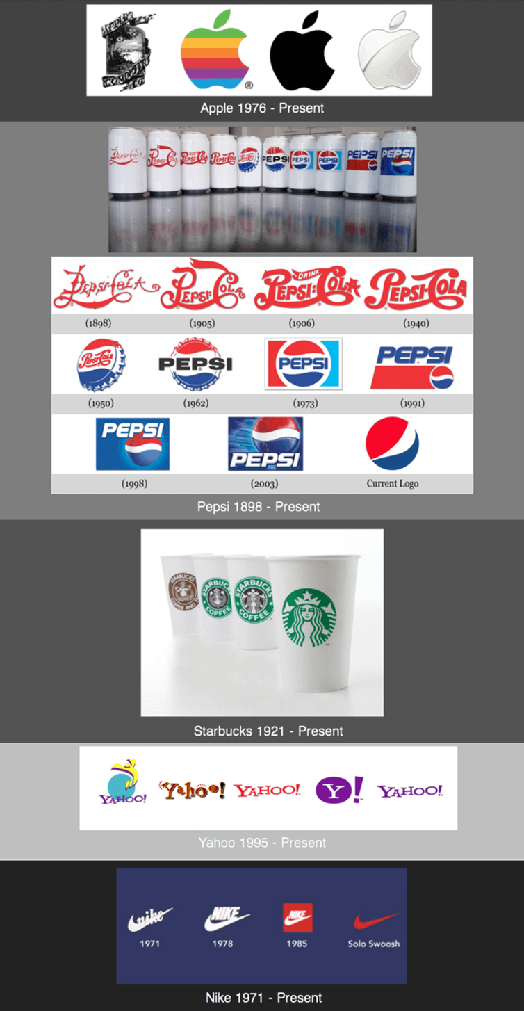
No Trending!
“Trends are temporary and make your logo a time capsule, rather than timeless,” says Ignacio Galarraga in 10 Common Mistakes in Logo Design for The Netmen Corp., a graphic design company. The author is right. Seasonal ideas won’t work for a logo requirement, which has to remain stable and constant for as long as the brand remains salient and alive in the market. Don’t follow what is in vogue now. Instead gun for what will remain in vogue – always.
Professionally-trained graphic designers will summarily ignore all passing trends. Websites such as the Logolounge keeps a track on these constantly-changing trends. Taking a cue from there, you can play safe and develop a company logo design that is uniquely bespoke and likely to remain stable.
Recommended: Identify Your Brand Please
Be Intuitive
In team brainstorming sessions you might capture five or 500 concepts but not every idea merits execution. In case the entire team goes into the second step of then narrowing down the business in a few words, there will again be no end to this exercise. At this point, the team leader has to take a stand and trust his/her intuition else the exercise could turn emotionally-messy and time-consuming and nothing concrete will emerge out of it. But don’t fret. That is how a brainstorming session is meant to be. After you are done with all the sound and fury, simply go with your gut!
Know that you can never get it bang on target in the first round. So go mess with ideas. Run the whole course. Then choose a spot where you can sit and relax. That’s your client’s logo!
Along the way, there would be quite a few logo design mistakes that could have been avoided, but aren’t. Don’t worry. Just be vigilant and go with the flow. All set!!