Let's Talk
We would love to hear from you. Want to know more about our services or have any questions? Say Hi!

The Art of Print Ads
Long-form films, mobile wizardry, VR, and AI – the world has come a long way in going digital. Still, you can’t just overlook print ads. The medium is still as powerful and relevant as it was, a decade or so ago.
You are still sure to find vintage posters, billboard ads and small scale magazine ads every now and then.
When it comes to print advertising the main things to focus on, are visibility and the message.
“Print advertising should be recognisable at a hundred paces, and it should be obvious who it’s an ad for without seeing the brand name” says Paul Arden in his book, “its Not How Good You Are, its How Good You Want to be.”
It doesn’t matter what medium you choose, you will have to go with a concept that is sure to stick in the minds of your target audience. This is exactly what these print ads did:

The Fevikwik Instant Adhesive: Teapot Ad
This is one of Ogilvy & Mather’s three-part print advertisement series for Fevikwik, where in the product has been cleverly illustrated by adopting a monochrome colour scheme. There is a subtle message that this graphic poster conveys – ‘When an object you love breaks, it breaks your Heart. But Fevikwik adhesive can fix it up for you, instantly.’
Image Source: Theadvertseeker

McCann Erickson’s Ashtanga Yoga Print Ad
McCann Erickson, an Israel based advertising agency, came up with a nice creative for Ashtanga Yoga to emphasize the beneficial effects yoga practice can have on the back. “Before your back attacks you, Ashtanga Yoga at the Garage fitness club”, was an apt tagline for this brilliantly innovative ad.
Image Source: Adsoftheworld
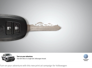
Volkswagen Amarok’s ‘Turn on Your Adventure’ Ad
You might ask what is so creative about this print ad; but if you look at the grooves of the car key carefully, you will notice a mountainous landscape. There are other ads in the same series with the grooves of the car key resembling a safari and a city too. The clever concept coaxes you to ‘turn on the adventure’ with Volkswagen Amarok giving you 620 miles out of a single tank of fuel.
Image Source: Strosewrites

Burger King’s “Burning Stores” Campaign
Of all the print campaigns, the most audacious one is probably Burger King’s “Burning Stores” campaign, created by David Miami. With the headline as “Flame Grilled since 1954,” the campaign displayed pics of actual BK restaurants that were caught on fire. Call it ridiculously brave or bravely ridiculous –the campaign did play its part in connecting with the audience by showing the brand at its worst possible moment. After all being transparent and authentic pays.
Image Source: Adforum
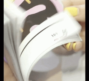
Toyota’s Magazine Stunt
Through a flip book style animation ad that ran across 30 consecutive editorial pages of The Fader, Toyota showed that it was possible to create stunts in print. As you flipped through the book you could see the C-HR vehicle spinning across the pages and driving off, leaving a lovely fuchsia trail behind. Consequently, they also came up with a full page print ad, also heavy on fuchsia, with the words “Good looks; Bad Intentions.”
Image Source: Adweek
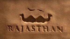
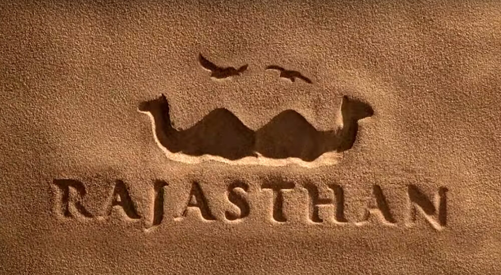
Rajasthan Tourism Ad
It doesn’t matter whether you see two camels or a big moustache, this Rajasthan Tourism ad by Ogilvy & Mather captures the true essence of Rajasthan perfectly.

Talk about Ogilvy & Mather, here is another of their brilliant ads. Using simple illustrations and effective colour combinations, this ad of allergy medicine seems to pop out of the page.
It is not just about the products; there are many print ads that have been released to raise awareness about important causes.
Image Source: Adsoftheworld

Vinay Saya and Siddharth Basavaraj came up with this instantly striking ad to create awareness about global warming. Using Photoshop, they were able to produce a skyline within the ice to help people recognize the message more quickly and effectively.
Image Source: Kulzy
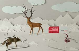
JWT came up with four paper art images for Alzas Bajas to put up ads in the Argentinian Magazine, Buenos Aires. Displaying gorgeous wildlife scenes the ads included a bit of explanatory text with the tagline – ‘more information, less risk.’
Image Source: Adsoftheworld
Death can be terrifying. But Melbourne Australia’s Metro train system took a unique approach to describe some of the dumbest ways to die. It came up with a comedy song enacted by cute animated characters to explain idiotic deaths. Not only did the campaign become viral, it also won a series of awards. Followed by the video campaign, they came up with a series of print ads in association with McCann ad agency, which are as brilliant as the video.
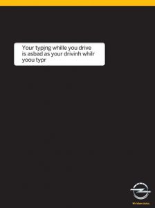
It is definitely not a good idea to use your mobile phone while driving. But how many of us follow this strictly?
Gitam BBDO has come up with this simple yet effective concept to point out the obvious facts of road safety. While the black background replicates that of a phone, the white box of text makes the message prominent.
Image Source: Theultralinx
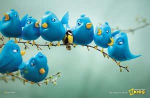
The only bird that kids of today are interested in is probably the twitter bird, thanks to the social networking sites and ever-expanding distraction provided by the gaming consoles. FoxP2, an advertising agency from Cape Town decided to use this very instantly recognizable blue bird in its ad for National Geographic channel, to help kids understand the difference between nature and technology. The beautiful real bird amidst all the technologically crafted blue birds no doubt catches the eye instantly.
Image Source: Adsoftheworld

Some ads are terrifying yet brilliant like the Duracell ad developed by Grey advertising agency, Singapore. Against the tagline “Some toys never die,” the ad features an evil looking doll at the doorway of a young girl’s playroom. Although a bit on the left-field because of its terrifying visual, the ad still works well to promote the long-lasting batteries of Duracell.
Image Source: Adsoftheworld
Print may be a lot cheaper than the other forms of advertising, but it is still as effective. However, brands need to take a risk and come up with a refreshing point of view. So, get ready to look beyond and create a positive impact in an innovative way.